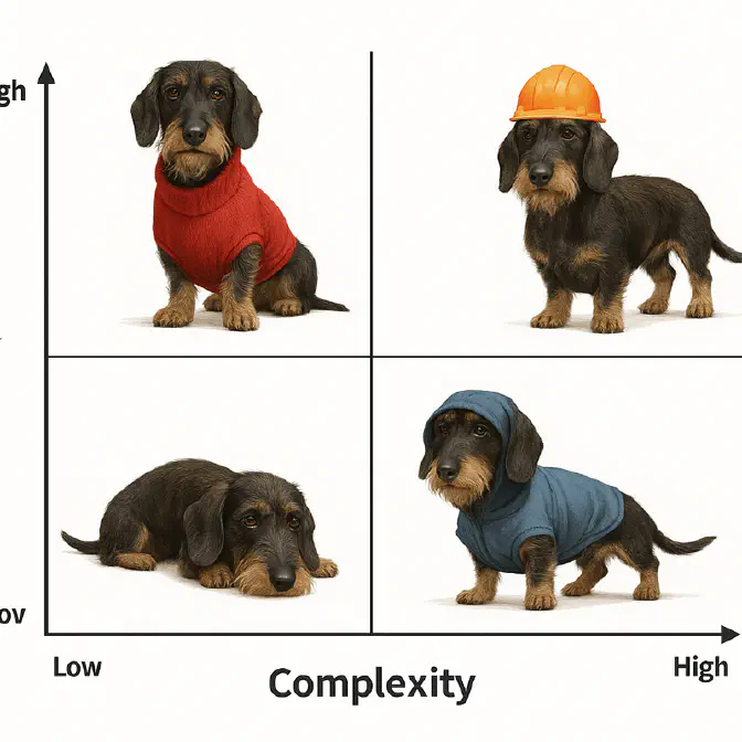
Objective Prioritisation: Value vs Complexity Matrix
Visual Clarity for Teams Who Think in Quadrants, Not Numbers
This is one of RoadmapOne ’s articles on Objective Prioritisation frameworks .
The problem with most prioritisation frameworks is that they produce numbers. RICE scores, WSJF calculations, ICE multiplications—all generating rankings that require explanation. Executives squint at spreadsheets. Stakeholders debate whether 450 is meaningfully different from 430. Teams spend more time justifying scores than building product. Enter the Value vs Complexity Matrix—a visual 2×2 grid that eliminates numeric debates by forcing every objective into one of four quadrants: Quick Wins, Major Projects, Fill-ins, or Money Pits.
Plot Value on one axis, Complexity on the other, and watch 80 objectives collapse into instant visual clarity. The Quick Wins quadrant screams “do these now.” The Money Pits quadrant screams “kill these immediately.” Major Projects require strategic debate about resource allocation. Fill-ins are optional scope when you have spare capacity. The entire roadmap becomes a picture, not a spreadsheet, and suddenly everyone from the CEO to junior developers understands the prioritisation logic.
TL;DR: The Value vs Complexity Matrix is prioritisation stripped to its visual essence—high/low value crossed with high/low complexity creates four actionable quadrants. It excels at stakeholder communication, fast decision-making, and revealing the portfolio’s shape at a glance. But it sacrifices quantitative rigour, hides nuance, and only works if your team agrees on what “value” and “complexity” actually mean.
The Two Dimensions of Value vs Complexity
Unlike scoring frameworks that multiply dimensions, the Value vs Complexity Matrix uses just two: Value (how much this objective improves the product or business) and Complexity (how difficult this is to build). Both are typically scored 1-10, but the magic isn’t in the numbers—it’s in where objectives land on the grid. High Value + Low Complexity = Quick Win. Low Value + High Complexity = Money Pit. The quadrant is the insight.
Value: How Much Does This Matter?
Value measures the benefit this objective delivers—to users, to the business, to strategic positioning. Unlike RICE’s separate Reach and Impact dimensions, Value compresses everything into one judgment: “Does this move the needle significantly?” A 9-10 on Value means this transforms the product. A 1-2 means this is marginal polish. The middle scores (4-6) represent incremental improvements that matter but don’t wow.
The challenge with Value is that it’s subjective and context-dependent. Revenue-generating features score high in sales-led organisations. User experience improvements score high in product-led growth companies. Technical debt reduction might score low on customer value but high on engineering efficiency. Teams must agree on their Value definition before scoring, or the exercise collapses into everyone advocating for their pet metrics.
The advantage of a single Value dimension is speed. Instead of debating whether Reach is 5,000 or 8,000 users, and whether Impact is “High” or “Massive,” you debate one question: “On a scale of 1-10, how valuable is this?” That compression forces clarity. Teams discover they’ve been arguing about the same thing using different words. Alignment emerges.
Complexity: How Hard Is This to Build?
Complexity measures the effort, risk, and difficulty of delivering this objective. Unlike RICE’s Effort dimension (measured in person-months), Complexity is a gut-feel estimate: “Does this feel easy or hard?” A 1-2 means it’s a quick build—days or a sprint at most. An 8-10 means it’s a multi-quarter odyssey involving multiple teams, integration nightmares, and technical risk. Mid-range scores (4-6) represent moderate engineering challenges.
Complexity compresses technical estimation into intuition. You’re not calculating person-months across engineering, design, and QA; you’re pattern-matching against past work and judging relative difficulty. This trades precision for speed—scoring 50 objectives takes 30 minutes instead of three hours. The loss of precision is the gain in decisiveness.
The trap with Complexity is that engineers habitually underestimate difficulty. A feature scored 3 (low complexity) turns into a 6-month nightmare once you encounter edge cases, legacy system constraints, and scope creep. Calibrate by tracking estimated Complexity versus actual delivery. If your “3s” consistently take three months, your scale is broken. Adjust or overlay a pessimism multiplier.
The Four Quadrants—Where Strategy Becomes Obvious
The Value vs Complexity Matrix’s power is in its quadrants. Once you’ve plotted objectives, the grid tells you what to do. No formulas, no weighted scores, just visual clustering that makes trade-offs obvious.
Quadrant 1: Quick Wins (High Value, Low Complexity)
Quick Wins are the low-hanging fruit—objectives delivering meaningful value without heroic effort. These are your 8-10 Value, 1-3 Complexity objectives. They’re the features users desperately want that you can ship in a sprint or two. They’re the bugs blocking major customers that a single engineer can fix in a week. They’re the copy changes that double conversion rates.
Quick Wins get built first, always. There’s no strategic debate here. If something scores high value and low complexity, and you’re not building it, you’re incompetent or distracted. These objectives fund themselves immediately through impact delivered per effort spent. Ship them, measure the results, and use those wins to build credibility for harder bets.
The only reason not to build Quick Wins immediately is if they’re tactical wins that distract from strategic positioning. That mobile app dark mode scoring 9 on Value (users love it) and 2 on Complexity (three days of work) might still wait if your strategic imperative is enterprise features. But those cases are rare. Quick Wins are called “quick” for a reason—ship them fast, harvest the value, and move on.
Quadrant 2: Major Projects (High Value, High Complexity)
Major Projects are the big bets—transformational objectives that require serious resources and time. These are your 8-10 Value, 8-10 Complexity objectives. They’re platform rebuilds, new product lines, market expansions, and architectural overhauls. They promise massive impact but demand months or years of focus and risk significant opportunity cost.
Major Projects require strategic debate. You can’t fund all of them simultaneously—they’d consume your entire roadmap and leave no room for iteration or course correction. The question isn’t “should we do this?"—high value means yes, eventually. The question is “when, and what do we sacrifice to make room?” Some Major Projects are foundational bets you take despite the cost. Others wait for the right market window or resource availability.
The trap with Major Projects is betting the farm. Teams see the 10 Value score and ignore the 10 Complexity score, committing to massive initiatives without fallback plans. Six months in, they’re halfway done with nothing shippable, competitors have moved, and the market has shifted. The cure is staging: break Major Projects into phases where each phase delivers measurable value. That infrastructure rebuild? Phase 1 migrates 20% of traffic and validates the approach. Major Projects are bets, not certainties—de-risk them.
Quadrant 3: Fill-ins (Low Value, Low Complexity)
Fill-ins are the “nice to have” polish—objectives that improve the product marginally without consuming significant resources. These are your 1-4 Value, 1-3 Complexity objectives. They’re small UX refinements, minor feature requests, cosmetic improvements, and quality-of-life tweaks. They don’t transform the product, but they’re cheap to build and make users slightly happier.
Fill-ins are scope flexibility. When your team finishes a Quick Win ahead of schedule and has two days left in the sprint, Fill-ins absorb that capacity. When morale is low from grinding on Major Projects, Fill-ins provide easy wins that remind teams they can still ship. They’re the roadmap’s shock absorber—low stakes, low effort, always available when you need small victories.
The danger with Fill-ins is death by a thousand cuts. If your roadmap is 60% Fill-ins, you’re polishing incrementally while competitors build transformationally. Fill-ins feel productive—you’re shipping constantly—but impact stalls. The fix is explicit portfolio limits: no more than 20% of capacity on Fill-ins. Reserve the rest for Quick Wins and strategic Major Projects. Fill-ins are dessert, not the main course.
Quadrant 4: Money Pits (Low Value, High Complexity)
Money Pits are the objectives you kill immediately—low value combined with high complexity creates negative ROI. These are your 1-4 Value, 8-10 Complexity objectives. They’re the CEO’s pet project that users don’t want and engineering can’t build efficiently. They’re the “strategic partnership” integration consuming six months for 100 users. They’re the over-engineered solution to a problem that doesn’t exist.
Money Pits appear on roadmaps through politics, not logic. Someone important championed the idea. A vendor pitched it convincingly. A competitor launched something similar, triggering FOMO. The Value vs Complexity Matrix exposes Money Pits visually—when an objective lands in the bottom-right quadrant, everyone sees it simultaneously. The data creates permission to kill it without personal conflict.
The only exception to killing Money Pits is hidden strategic value that the Value score missed. That compliance integration scoring 2 on Value (no user impact) and 9 on Complexity (six months of work) might be non-negotiable for enterprise sales. But if you’re classifying non-negotiable compliance as “Low Value,” your Value definition is broken. Recalibrate or override deliberately—don’t let genuine Money Pits masquerade as strategic imperatives.
When the Matrix Is Your Best Weapon
The Value vs Complexity Matrix excels in three contexts. First, stakeholder communication with non-technical audiences. Boards and executives understand quadrants intuitively. Show them the 2×2 grid with objectives plotted, and they immediately grasp the portfolio’s shape without needing RICE formulas explained. The visual is the insight.
Second, fast prioritisation when precision is impossible. Early-stage startups, new product lines, or markets with thin data can’t support elaborate scoring frameworks. You don’t have reach estimates or effort data. But you can gut-check “Does this feel high value or low value? Does this feel easy or hard?” The Matrix provides structure without demanding precision you don’t have.
Third, portfolio rebalancing conversations. When leadership asks “Are we spending too much on infrastructure versus features?” the Matrix answers visually. If 70% of objectives cluster in Major Projects (high complexity), you’re betting big without quick wins. If 80% cluster in Fill-ins (low value), you’re polishing while competitors innovate. The grid exposes imbalances that numbers hide.
When the Matrix Betrays You
The Matrix collapses in three scenarios. First, when Value and Complexity definitions are contested. If product thinks “Value” means user satisfaction and engineering thinks it means revenue, your quadrants are nonsense. Different value definitions produce different placements, and the visual clarity becomes visual chaos. The fix is aligning on definitions before plotting—but that alignment often takes longer than just using RICE.
Second, when nuance matters more than simplicity. The Matrix compresses Reach, Impact, Confidence, Urgency, and Strategic Fit into one “Value” score. Sometimes that compression destroys critical information. That feature might score 8 on Value overall, but it’s 10 on Reach and 3 on Impact—meaning it touches everyone but changes nothing. RICE would surface that; the Matrix hides it. Use RICE when nuance beats simplicity.
Third, when teams game the quadrants. Product managers learn that High Value + Low Complexity gets built immediately, so they inflate Value scores and deflate Complexity scores to push their objectives into Quick Wins. Soon everything is “definitely an 8 on Value” and “probably a 3 on Complexity.” The quadrants lose meaning. Combat this with forced distributions: only 20% of objectives can score 8-10 on Value, only 20% can score 1-3 on Complexity. Enforcement preserves integrity.
Practical Implementation
Start by gathering cross-functional leads—product, engineering, design, leadership. Define what “Value” means for your organisation. Is it revenue? User impact? Strategic positioning? Write it down. Then define “Complexity”—effort, technical risk, or both? Agree on the definitions before scoring, or the exercise fails.
Score your top 50 objectives rapidly. For each, debate and assign Value (1-10) and Complexity (1-10). Don’t overthink—gut instincts are sufficient. This takes 45-60 minutes, not hours. The goal is relative positioning, not absolute precision.
Plot the objectives on the 2×2 grid in RoadmapOne. Watch the quadrants populate. You’ll immediately see clustering: “Oh, we have 15 Major Projects and 2 Quick Wins—no wonder we’re slow to deliver.” The visual exposes portfolio imbalances that spreadsheets hide.
Draw the capacity line (using capacity-based planning ) within Quick Wins first, then Major Projects second. If you have three squads for one quarter, fund all Quick Wins (they’re cheap) plus 2-3 Major Projects. Fill-ins absorb leftover capacity. Money Pits get killed or justified as strategic overrides.
Review the Matrix quarterly and re-plot. Last quarter’s Major Project might now be a Fill-in if scope shrunk. Last quarter’s Fill-in might now be a Quick Win if value increased. Continuous re-plotting keeps the roadmap aligned with current reality, not stale estimates.
The Matrix and Strategic Clarity
The Value vs Complexity Matrix is prioritisation for teams who think visually, not numerically. It trades quantitative rigour for instant comprehension, and that trade often creates more alignment than perfect scoring ever could. Executives see the Quick Wins quadrant and ask why you’re not shipping those. Engineers see the Money Pits quadrant and stop arguing for doomed pet projects. Product sees the Major Projects cluster and realises they’ve bet everything on big swings with no quick wins to fund them.
RoadmapOne makes the Matrix visible at portfolio scale. Plot objectives on Value vs Complexity, let the quadrants reveal your strategic balance, and use the visual to drive debates. When the CEO wants to fund that Money Pit, you don’t argue scores—you point at the quadrant and say “This is low value and high complexity. What are we not building to make room for this?”
The Matrix won’t give you perfect answers—no framework does. But it will give you answers everyone can see, understand, and debate without needing a PhD in product management frameworks. And sometimes, visual clarity beats quantitative precision.
Your roadmap isn’t a formula—it’s a portfolio of bets. The Value vs Complexity Matrix shows you which bets are worth making, which are slam dunks, which are optional, and which are just burning money. Plot it, see it, decide accordingly.
For more on Objective Prioritisation frameworks, see our comprehensive guide .